Create basic app UI layouts with Titanium SDK
In this tutorial we will have a look at some basic app UI's and how to navigate between windows. It will start with a basic window and uses some more complex setups you will find in other apps, too. Of course you can always create a custom menu and navigate from window to another but here we will cover some basic/native ways to do so.
Plain setup
The first and easiest solution is to create a plain window that allows you to fully customize the content. The Alloy XML part looks like this:
index.xml
<Alloy>
    <Window title="Window"/>
</Alloy>
index.js
$.index.open();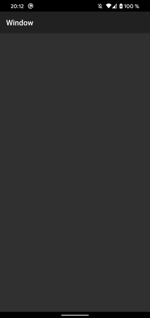

Inside the Window tag you can add all other like Buttons, Labels, Images and so on.
Open other windows
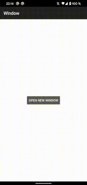
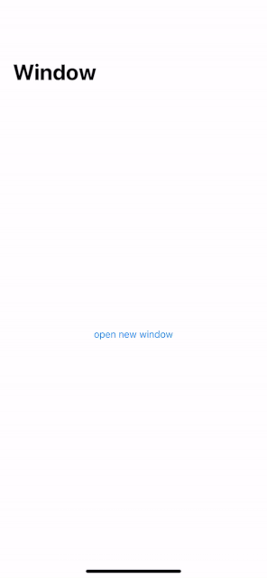
Of course most of the apps consist of multiple windows. To do that we will add a Button to the first window:
index.xml
<Alloy>
    <Window title="Window">
        <Button title="open new window" onClick="onClickButton"/>
    </Window>
</Alloy>
index.js
function onClickButton(e) {
    // click event
}

$.index.open();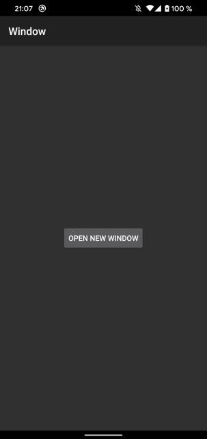

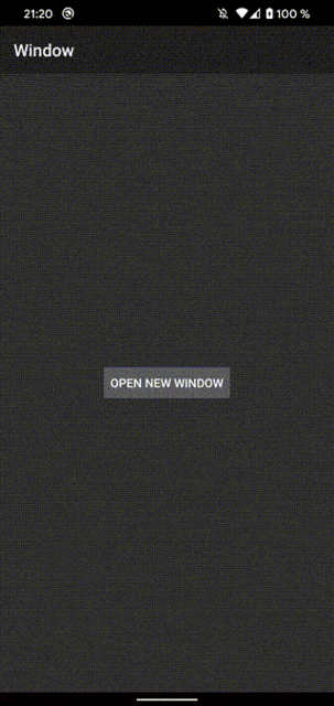
Now we create a second controller; either with alloy generate controller [controllerName] or inside the UI by clicking the + button in the top right corner (e.g. in Atom).
Name the second controller "secondWindow" and add a window inside the new XML:
secondWindow.xml
<Alloy>
    <Window title="Window two" backgroundColor="#AAF"/>
</Alloy>
secondWindow.js
$.secondWindow.open();To open the second window we need to create a new controller inside the click event of the first window:
index.js
function onClickButton(e) {
    // click event
    Alloy.createController("/secondWindow");
}

$.index.open();
Now the second window will open when you click the button.
As you can see you have to close the window by using the e.g. swipe gesture. To have a structure between the main window and the child windows we can use a NavigationWindow.
Navigation Window
We use the project structure from the first example and we add a NavigationWindow around the window:
index.xml
<Alloy>
    <NavigationWindow id="navWin">
        <Window title="Window">
            <Button title="open new window" onClick="onClickButton"/>
        </Window>
    </NavigationWindow>
</Alloy>
Inside the controller we change some parts too:
index.js
function onClickButton(e) {
    // click event
    var win2 = Alloy.createController("/secondWindow");
    $.navWin.openWindow(win2.getView());
}

$.navWin.open();
Now it will open the NavigationWindow and we use openWindow to open the child window.
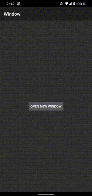

As you can see the second window has a back button now and on iOS you see a window title.
Platform specific styling
Adding some platform specific styles and xml parts makes it behave more native:
index.tss
"Window" : {
    backgroundColor: "white"
}
"Window[platform=ios]" : {
    titleAttributes: {
        color: '#000'
    },
    largeTitleEnabled: true,
    largeTitleDisplayMode: Ti.UI.iOS.LARGE_TITLE_DISPLAY_MODE_ALWAYS
}
secondWindow.xml
<Alloy>
    <Window title="Window two" backgroundColor="#AAF">
        <ActionBar id="actionbar" platform="android" onHomeIconItemSelected="onClickClose" displayHomeAsUp="true"/>
    </Window>
</Alloy>
secondWindow.js
var args = $.args;

function onClickClose(e){
    $.secondWindow.close();
}
Tab group
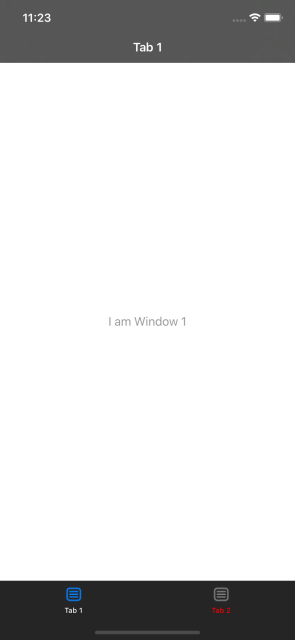
Another UI concept is a TabGroup. It will take multiple windows in one TabGroup and you have a menu at the top or bottom to switch between those (or swipe).
index.xml
<Alloy>
    <TabGroup backgroundColor="white" title="TabGroup">
        <Tab id="tab1" title="Tab 1">
            <Window id="win1" title="Tab 1">
                <Label id="label1" color="#999">I am Window 1</Label>
            </Window>
        </Tab>
        <Tab id="tab2" title="Tab 2">
            <Window id="win2" title="Tab 2">
                <Label id="label2" color="#999">I am Window 2</Label>
            </Window>
        </Tab>
    </TabGroup>
</Alloy>
index.js
$.index.open();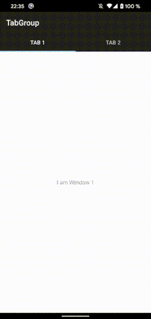

As you can see the default TabGroup menu on Android is at the top.
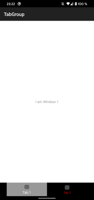
BottomNavigation
You can also change the Android style to a BottomNavigation and or add some icons to the assets/images/ folder and change the style to:
index.xml
<Alloy>
    <TabGroup backgroundColor="white" title="TabGroup">
        <Tab id="tab1" title="Tab 1" icon="icon1.png">
            <Window id="win1" title="Tab 1">
                <Label id="label1" color="#999">I am Window 1</Label>
            </Window>
        </Tab>
        <Tab id="tab2" title="Tab 2" icon="icon1.png">
            <Window id="win2" title="Tab 2">
                <Label id="label2" color="#999">I am Window 2</Label>
            </Window>
        </Tab>
    </TabGroup>
</Alloy>
index.tss
"TabGroup":{
    tabsBackgroundSelectedColor:"#999",
    tabsBackgroundColor: "#000"
}
"Tab":{
    activeTitleColor:"#fff",
    titleColor: "#f00",
}
"TabGroup[platform=android]": {
    style: Ti.UI.Android.TABS_STYLE_BOTTOM_NAVIGATION
}
DrawerLayout (Android specific)
Android has a custom layout called "DrawerLayout". It is using a hamburger menu with a left/right panel and a center view. The basic layout looks like this:
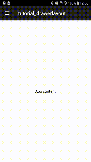
index.xml
<Alloy>
    <Window>
        <ActionBar platform="android" displayHomeAsUp="true" onHomeIconItemSelected="onClickToggle"/>
        <DrawerLayout id="drawer" platform="android">
            <LeftView>
                <View backgroundColor="#fff">
                    <Label text="Side menu"/>
                </View>
            </LeftView>
            <CenterView>
                <View backgroundColor="#fff">
                    <Label text="App content"/>
                </View>
            </CenterView>
        </DrawerLayout>
    </Window>
</Alloy>
index.js
function onClickToggle(e){
    $.drawer.toggleLeft();
}

$.index.open();
To make it a bit more flexible if you want to use it for iOS too we move the view part out of the XML and into the controller:
index.xml
<Alloy>
    <Window>
        <ActionBar platform="android" displayHomeAsUp="true" onHomeIconItemSelected="onClickToggle"/>
        <DrawerLayout id="drawer" platform="android" />
    </Window>
</Alloy>
index.js
var centerView = Ti.UI.createView({
    backgroundColor: "#fff"
});
var leftView = Ti.UI.createView({
    backgroundColor: "#fff"
});

var lbl1 = Ti.UI.createLabel({
    text: "center",
    color: "#000"
})

var lbl2 = Ti.UI.createLabel({
    text: "left",
    color: "#000"
})

centerView.add(lbl1);
leftView.add(lbl2);

if (OS_ANDROID){
    $.drawer.centerView = centerView;
    $.drawer.leftView = leftView;
}

function onClickToggle(e){
    $.drawer.toggleLeft();
}

$.index.open();
With this setup you can create a custom layout for iOS and use the same views without having duplicate content. To have the same hamburger menu setup on iOS you can create a custom layout or use a plugin like https://github.com/viezel/NappDrawer. The controller would look like this:
if (OS_IOS){
    var NappDrawerModule = require('dk.napp.drawer');
    var mainWindow = NappDrawerModule.createDrawer({
        centerWindow: $.index,
        leftWindow: leftView,
        openDrawerGestureMode: NappDrawerModule.OPEN_MODE_NONE,
        closeDrawerGestureMode: NappDrawerModule.CLOSE_MODE_TAP_CENTERWINDOW | NappDrawerModule.CLOSE_MODE_PANNING_CENTERWINDOW,
        statusBarStyle: NappDrawerModule.STATUSBAR_WHITE,
        orientationModes: [Ti.UI.PORTRAIT, Ti.UI.UPSIDE_PORTRAIT]
    });
    $.index.add(centerView);
    mainWindow.open();
}
We will cover modules in a different tutorial.