Android styling in Titanium using themes
Titanium allows you to use normal Android themes to style your entire application and customize elements that don't expose properties to Titanium. Make sure to read the official Titanium guide first how to setup your basic theme. In this tutorial I will show you some styling examples.
The good thing first: you can search for native Android theme examples and put them into your theme file. The "bad" part: it can be very tricky to find the right style/parent property - even in native land! And since Titanium and most Android apps use Material now the chances are high that old stackoverflow posts or examples won't work anymore.
Create a theme
We need a theme file first. Create a file called mytheme.xml in /app/platform/android/res/values/ with:
<?xml version="1.0" encoding="utf-8"?>
<resources>
    <style name="AppTheme" parent="Theme.Titanium.DayNight">
    </style>
</resources>
That is the basic Titanium theme with dark/night mode support and an action/status bar. You can use different parents from the Titanium material themes list.
Use the theme
A theme can be global or just for specific windows.
For a global theme (all windows) you edit your tiapp.xml and add android:theme to the <application> block:
<android xmlns:android="http://schemas.android.com/apk/res/android">
    <manifest>
        <application android:theme="@style/AppTheme"/>
    </manifest>
</android>
If you just want to style some windows you can use the theme property:
var win = Ti.UI.createWindow({theme: "AppTheme"});You can also add it to app.tss to style all windows but have the possiblity to change it without changing the tiapp.xml file.
How to style elements
In order to style elements you will need to know the item name and how to connect them. Basic elements are for example:
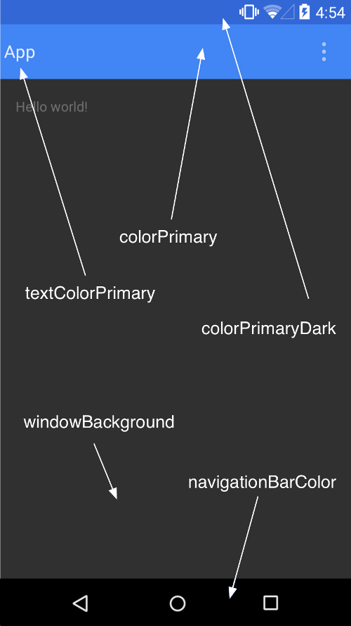
and you can put
<item name="colorPrimary">#1565C0</item>into your <styles> section.
If you want to change button styles you have to create a style block for it. A whole list of items and their styles is in the offical Android themes_material.xml and have a look at the Material components document. You will find components like button and they have a implementation section with theming information: https://material.io/components/buttons/android#theming-buttons
That is most of the time the best and quickest way to find the correct style to theme your elements!
To style a button you can use:
<style name="AppTheme" parent="Theme.Titanium.DayNight">
    <item name="materialButtonStyle">@style/Widget.App.Button</item>
</style>

<style name="Widget.App.Button" parent="Widget.MaterialComponents.Button">
    <item name="android:padding">0dp</item>
    <item name="android:insetTop">0dp</item>
    <item name="android:insetBottom">0dp</item>
</style>
This will remove the extra padding/margin from the buttons.
Examples
Arrow / menu item in Actionbar
To style the arrow or menu dots in the Actionbar you can use the following theme:
<style name="AppTheme" parent="Theme.Titanium.DayNight">
    <item name="actionBarTheme">@style/MyActionBar</item>
</style>

<style name="MyActionBar" parent="@style/Theme.Titanium.DayNight">
    <!-- arrow / menu dot color -->
    <item name="colorControlNormal">#ffffff</item>
    <!-- actionbar background -->
    <item name="android:background">#00B587</item>
</style>
Note:
Beginning with 10.2.0 you can set a custom drawable as a homeAsUpIndicator (check https://github.com/tidev/titanium_mobile/pull/13149):
Place a drawable/icon into /app/platform/android/res/drawble.
file: ic_baseline_close_24.xml
<vector android:width="24dp" android:height="24dp" android:viewportWidth="24" android:viewportHeight="24" android:tint="?attr/colorControlNormal">
  <path android:fillColor="@android:color/white" android:pathData="M19,6.41L17.59,5 12,10.59 6.41,5 5,6.41 10.59,12 5,17.59 6.41,19 12,13.41 17.59,19 19,17.59 13.41,12z"/>
</vector>
and use this code:
// Titanium 10.2.0 example:
const window = Ti.UI.createWindow();
window.activity.onCreate = () => {
    const actionBar = window.activity.actionBar;
    actionBar.displayHomeAsUp = true;
    actionBar.homeButtonEnabled = true;
    actionBar.homeAsUpIndicator = Ti.App.Android.R.drawable.ic_baseline_close_24;
    actionBar.onHomeIconItemSelected = () => {
        alert("Clicked on ActionBar home icon.");
    };
};
window.open();
Toolbar (Titanium 10.2.0)
note: will work with Titanium 10.1.1.GA too but the drawable won't be tinted
When you use a Toolbar and want to style the icon, arrow and text you can use the following example:
index.xml
<Alloy>
    <Window title="" customToolbar="toolbar" theme="AppTheme">
        <Toolbar id="toolbar" title="Title" subtitle="Subtitle" barColor="#004F9F" width="Ti.UI.FILL" top="0" displayHomeAsUp="true" homeButtonEnabled="true"/>
        <Menu >
            <MenuItem icon="Titanium.App.Android.R.drawable.cogwheel" showAsAction="Ti.Android.SHOW_AS_ACTION_ALWAYS"/>
        </Menu>
    </Window>
</Alloy>
and a cogwheel.xml file in /app/platform/android/res/drawable/cogwheel.xml:
<?xml version="1.0" encoding="utf-8"?>
<vector xmlns:android="http://schemas.android.com/apk/res/android"
    android:width="59.999998dp"
    android:height="60.903094dp"
    android:viewportWidth="59.999998"
    android:tint="?attr/colorControlNormal"
    android:viewportHeight="60.903094">

    <path
        android:fillColor="#ffffff"
        android:strokeWidth="0.0592785"
        android:pathData="M 26.880942,15.410922 c -0.302379,0 -0.755341,0.302531 -0.755341,0.604851 l -0.604851,4.08154 c -0.906959,0.302321 -1.662936,0.906043 -2.569895,1.510682 l -3.628143,-1.510682 c -0.45348,-0.151159 -0.75587,-3.76e-4 -1.058249,0.301944 l -3.023292,5.290278 c -0.15116,0.151161 5.88e-4,0.604475 0.302908,0.906795 l 3.173781,2.419405 c 0,0.45348 -0.150489,0.907007 -0.150489,1.511646 0,0.60464 -6.71e-4,1.057202 0.150489,1.510681 l -3.173781,2.569895 c -0.30232,0.302379 -0.302614,0.60538 -0.151454,0.907759 l 3.023292,5.290279 c 0.15116,0.151161 0.453256,0.302614 0.906795,0.151454 l 3.779597,-1.511646 c 0.755799,0.60464 1.66197,1.058166 2.56893,1.511646 l 0.604851,3.930087 c 0,0.302319 0.302825,0.603886 0.756306,0.603886 h 6.045619 c 0.302379,0 0.756305,-0.301625 0.756305,-0.603886 l 0.604851,-3.930087 c 0.90696,-0.45348 1.814095,-0.907006 2.569895,-1.511646 l 3.778633,1.511646 c 0.302379,0.15116 0.755575,-5.29e-4 0.906794,-0.302908 l 3.023292,-5.290278 c 0.15116,-0.30232 0.150925,-0.755635 -0.151454,-0.906795 l -3.476689,-2.419406 c 0,-0.453479 0.151454,-0.906041 0.151454,-1.510681 0,-0.604639 -2.94e-4,-1.058166 -0.151454,-1.511646 l 3.174746,-2.569894 c 0.302319,-0.30232 0.302614,-0.604475 0.151454,-0.906795 L 41.39255,20.247803 c -0.15116,-0.15116 -0.453256,-0.301649 -0.906795,-0.15049 l -3.779597,1.510682 c -0.7558,-0.604639 -1.662936,-1.057202 -2.569895,-1.510682 l -0.603886,-3.931051 c 0.15116,-0.453479 -0.302592,-0.75534 -0.604852,-0.75534 z m 3.023292,9.825216 c 2.872037,0 5.290278,2.419206 5.290278,5.291243 0,2.872038 -2.418241,5.290279 -5.290278,5.290279 -2.872038,0 -5.290279,-2.418241 -5.290279,-5.290279 0,-2.872037 2.418241,-5.291243 5.290279,-5.291243 z" />
</vector>
default theme (we have to disable the actionbar to use a toolbar):
<?xml version="1.0" encoding="utf-8"?>
<resources>
    <style name="AppTheme" parent="Theme.Titanium.DayNight.NoTitleBar"></style>
</resources>
Now we can use this theme to style each element:
<?xml version="1.0" encoding="utf-8"?>
<resources>
    <style name="AppTheme" parent="Theme.Titanium.DayNight.NoTitleBar">
        <item name="toolbarStyle">@style/Widget.App.Toolbar</item>
    </style>

    <style name="Widget.App.Toolbar" parent="Widget.MaterialComponents.Toolbar.Primary">
    <!-- title color -->
        <item name="titleTextColor">#f00</item>
    <!-- sub title color -->
        <item name="subtitleTextColor">#f0f</item>
    <!-- elements -->
        <item name="materialThemeOverlay">@style/ThemeOverlay.App.Toolbar</item>
    </style>

    <style name="ThemeOverlay.App.Toolbar" parent="">
    <!-- element tint color -->
        <item name="colorControlNormal">#ff0</item>
    </style>

</resources>
and we will get a wild color scheme:

Actionbar (Titanium 10.2.0)
note: will work with Titanium 10.1.1.GA too but the drawable won't be tinted
If we have the same setup as above but with an Actionbar:
<Alloy>
    <Window title="demoApp" theme="AppTheme">
        <ActionBar homeButtonEnabled="true" displayHomeAsUp="true"/>
        <Menu >
            <MenuItem id="menu1" icon="Titanium.App.Android.R.drawable.cogwheel" showAsAction="Ti.Android.SHOW_AS_ACTION_ALWAYS" onClick="test"/>
        </Menu>
    </Window>
</Alloy>
we can use this theme:
<?xml version="1.0" encoding="utf-8"?>
<resources>
    <style name="AppTheme" parent="Theme.Titanium.DayNight">
        <item name="actionBarTheme">@style/MyApp.ActionBarTheme</item>
    </style>

    <style name="MyActionBar" parent="@style/Theme.Titanium.DayNight">
        <item name="colorControlNormal">#ff00ff</item>
        <item name="android:background">#004F9F</item>
        <item name="android:textColorPrimary">#ff0</item>
    </style>
</resources>
to get the same styling as with the Toolbar:

ListView headerTitle
When Titanium switched to use a RecyclerView for TableViews and ListViews they've also added more styling options to the header/footer titles. You have some custom attributes:
<attr name="ti_headerTitleSize" format="string" />
<attr name="ti_headerTitleStyle" format="string" />
<attr name="ti_headerTitleColor" format="color" />
<attr name="ti_headerTitleBackground" format="reference" />
<attr name="ti_headerTitleBackgroundColor" format="color" />
<attr name="ti_footerTitleSize" format="string" />
<attr name="ti_footerTitleStyle" format="string" />
<attr name="ti_footerTitleColor" format="color" />
<attr name="ti_footerTitleBackground" format="reference" />
<attr name="ti_footerTitleBackgroundColor" format="color" />(source SDK)
that you can style.
In your theme you can use them like this:
<style name="AppTheme" parent="Theme.Titanium.DayNight.Solid.NoTitleBar">
    <item name="ti_headerTitleSize">@string/ti_headerTitleSize</item>
    <item name="ti_headerTitleColor">@color/ti_headerTitleColor</item>
</style>

<string name="ti_headerTitleSize">60dip</string>
<color name="ti_headerTitleColor">#ff0000</color>
Result is:

OptionBar
If you use a OptionBar inside your app like this:
const win = Ti.UI.createWindow();
const optionBar = Ti.UI.createOptionBar({
  labels: [ 'Option 1', 'Option 2', 'Option 3' ],
  tintColor: "#f00"
});
const btn = Ti.UI.createButton({
  title:"reset", bottom: 10
})
optionBar.addEventListener('click', (e) => {
  Ti.API.info(`Option ${e.index} was selected.`);
});
btn.addEventListener('click', (e) => {
  optionBar.index = -1;
});
win.add([optionBar,btn]);

win.open();
You have to use a color selector setup to change the selected and non selected color. To do this you have to create a "mycolor.xml" file inside "/platform/android/res/color/" with this content:
<?xml version="1.0" encoding="utf-8"?>
<selector xmlns:android="http://schemas.android.com/apk/res/android">
    <item android:color="#f00" android:state_checked="true"/>
    <item android:color="#f0f"/>
</selector>
and in your theme you have to add
<style sname="Widget.MaterialComponents.Button.OutlinedButton" parent="Widget.MaterialComponents.Button.TextButton">
<item name="strokeColor">#f00</item>
<item name="strokeWidth">1dp</item>
<item name="backgroundTint">@color/mycolor</item>
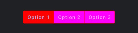
</style>The result will be
Dialog radio buttons
To style the items of a dialog box with radio buttons you can use the following example
<style name="AppTheme" parent="Theme.Titanium.DayNight.Solid.NoTitleBar">
<item name="materialAlertDialogTheme">@style/materialDialog</item>
</style>
<style name="materialDialog" parent="Theme.AppCompat.Dialog.Alert">
<item name="colorAccent">#f00</item>
<item name="android:background">#fff</item>
<item name="android:textColorPrimary">#999</item>
<item name="textColorAlertDialogListItem">#000</item>
<item name="buttonBarPositiveButtonStyle">@style/Alert.Button.Positive</item>
<item name="buttonBarNeutralButtonStyle">@style/Alert.Button.Neutral</item>
<item name="colorControlNormal">#cacad1</item>
<item name="colorControlActivated">#04b6f4</item>
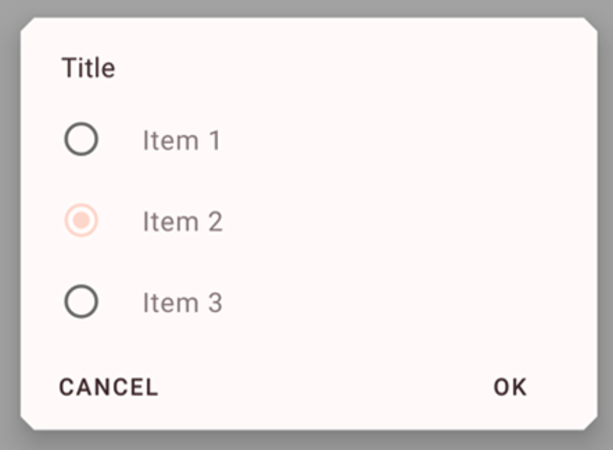
</style>OptionDialog
If you want to style an OptionDialog you can use this style
<style name="materialDialog" parent="ThemeOverlay.MaterialComponents.MaterialAlertDialog">
    <item name="colorSurface">#ff0000</item>
    <item name="colorOnSurface">#00ff00</item>
    <!-- <item name="android:backgroundDimEnabled">false</item> -->
    <item name="android:backgroundDimAmount">0.87</item>
</style>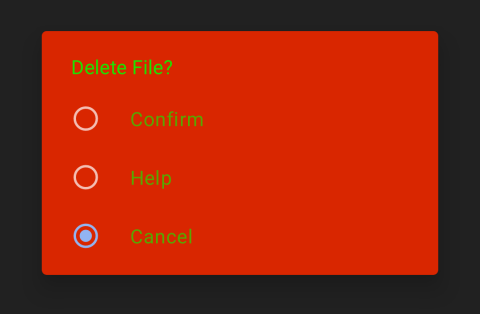
Calendar
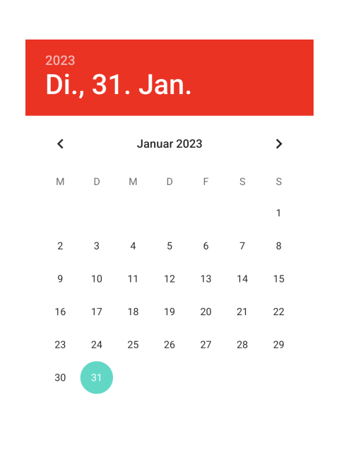
The inline calendar will use the colorAccent for the header. If you just want to change that color without changing all colorAccent you can use the following theme:
const win = Ti.UI.createWindow({theme:"MyTheme"});
var pick = Ti.UI.createPicker({type: Ti.UI.PICKER_TYPE_DATE, datePickerStyle: Ti.UI.DATE_PICKER_STYLE_INLINE})
win.add(pick);
win.open();
with:
<?xml version="1.0" encoding="utf-8"?>
<resources>
    <style name="MyTheme" parent="Theme.MaterialComponents.Light">
        <item name="android:datePickerStyle">@style/datePickerStyle</item>
    </style>

    <style name="datePickerStyle">
        <item name="android:headerBackground">#ff0000</item>
    </style>
</resources>
other values are:
- android:headerBackground
- android:dayOfWeekBackground
- android:dayOfWeekTextAppearance
- android:headerMonthTextAppearance
- android:headerDayOfMonthTextAppearance
- android:headerYearTextAppearance
- android:headerSelectedTextColor
- android:yearListItemTextAppearance
- android:yearListSelectorColor
- android:calendarTextColor
- android:calendarSelectedTextColor
TextArea padding
The TextArea is a Material TextInputLayout with an included TextInputEditText. If you want to remove the padding in Titanium it will just remove/add it for the outer TextInputLayout and not the acutal TextInputEditText (PR exists to fix that). You can use this theme to remove the padding from the left side:
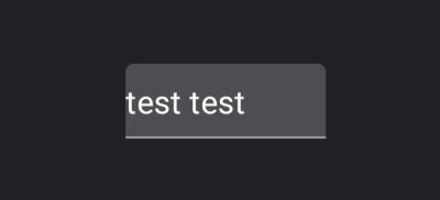
   <style name="MyTheme" parent="Theme.Titanium.DayNight">
        <item name="materialThemeOverlay">@style/myOverridingOverlay</item>
    </style>

    <style name="myOverridingOverlay" parent="">
        <item name="editTextStyle">@style/MyTextInputEditText_filledBox_dense</item>
    </style>

    <style name="MyTextInputEditText_filledBox_dense" parent="@style/Widget.MaterialComponents.TextInputEditText.FilledBox.Dense">
        <item name="android:paddingLeft">0dp</item>
        <item name="android:paddingRight">0dp</item>
    </style>
In case you use Hyperloop you can also use this code snippet
import TextInputLayout from 'com.google.android.material.textfield.TextInputLayout';
import View from 'android.view.View';
var tf = new View($.tf);
TextInputLayout.cast(tf).getEditText().setPadding(0, 10, 0, 10);
Switches
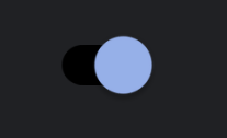
To style a Ti.UI.Switch track you have to create a custom drawable and assign that in your theme. First create a file called platform/android/res/drawable/track.xml with this content:
<selector xmlns:android="http://schemas.android.com/apk/res/android">
  <item android:color="#000000" android:state_checked="true"/>
  <item android:color="#ffffff" android:state_checked="false"/>
</selector>
and then use it in your theme like this:
<style name="MyTheme" parent="Theme.Titanium.DayNight">
    <item name="switchStyle">@style/Widget.App.Switch</item>
</style>

<style name="Widget.App.Switch" parent="Widget.MaterialComponents.CompoundButton.Switch">
    <item name="materialThemeOverlay">@style/ThemeOverlay.App.Switch</item>
</style>

<style name="ThemeOverlay.App.Switch" parent="">
    <item name="trackTint">@drawable/track</item>
</style>
You can do the same for thumbTint to change the thumb circle.
Other examples
If posted some other guides in the Show and tell section in the Github discussions